
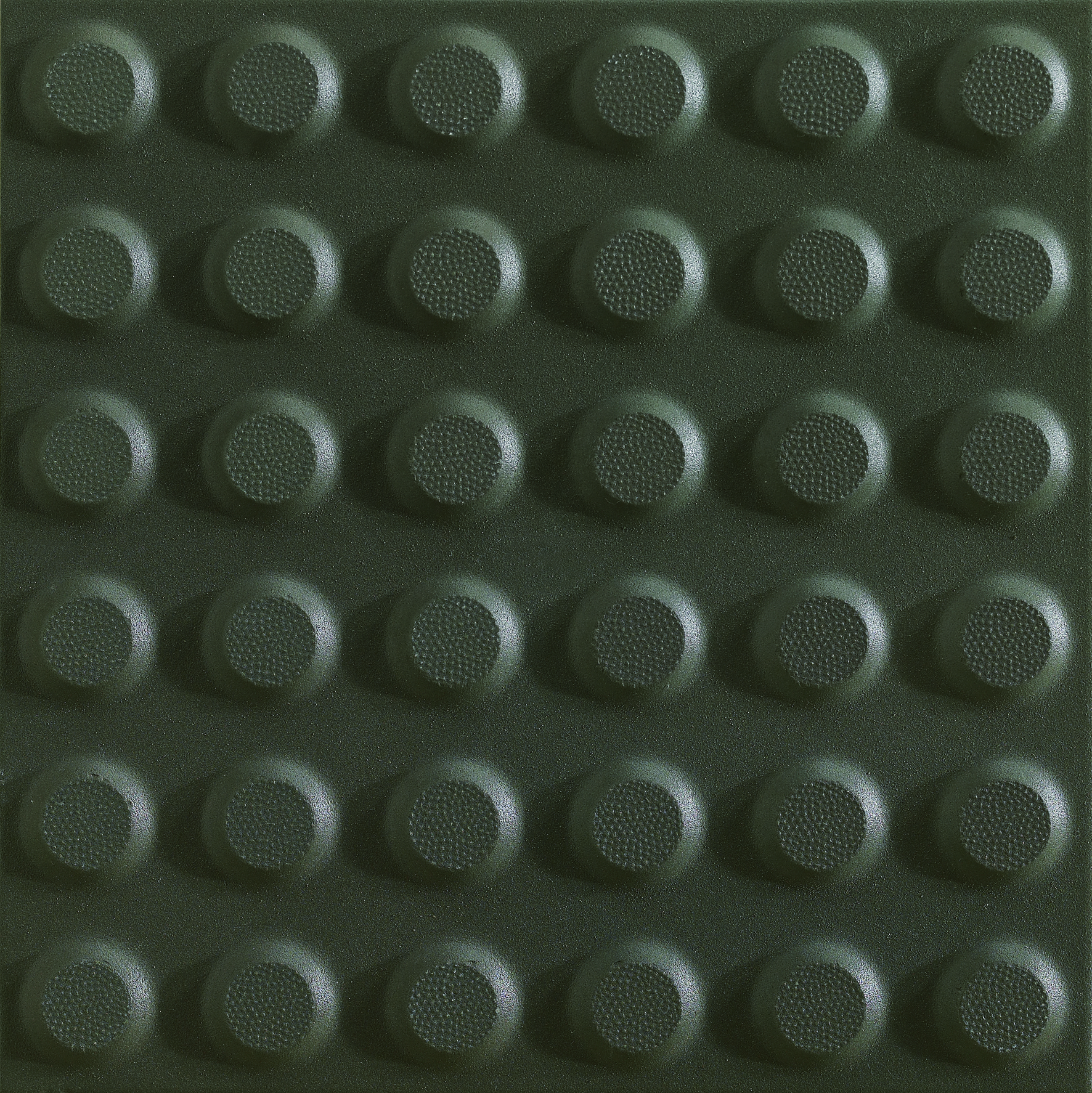
(3Tacbka) Tactile Plus Graphite Warning Dots
Why Smoke: Picked to read as cool against this tile's grey.Ask your tiler for Ultracolor Plus 119 (Mapei) or Fugabella Color 10 (Kerakoll).
Grey porcelain reads cleanest with cool walls. The warm-white option is for rooms that need a softer mood.
- 45° Mitre — Two tiles cut at 45° and butted together. No metal, no plastic. Crisp.
- Pencil bullnose — A separately-fired pencil rail in the matching tile finish, sat on the cut edge.
- Schlüter JOLLY — PVC, anodised aluminium, or brushed brass L-profile that caps the cut tile edge.
- Schlüter RONDEC — Quarter-round metal trim that turns the corner with a soft rolled edge.
- Schlüter SCHIENE — Right-angle metal edge that finishes a tile where it meets a different material.
Where the tiled floor meets timber, carpet, or vinyl, SCHIENE gives a flush, durable transition.
Ask your tiler for Schlüter SCHIENE (AC / ACGB).
Finish your next commercial project with our PLUS collection. Crafted for practicality and functionality, these tiles feature consistent colour and texture throughout, making them ideal for high-traffic areas. Full technical specifications are available on request. Included in this full body porcelain collection: + Step Treads, + Coves, + Base Tiles + Tactiles.
Need a large quantity? Request a wholesale quote for projects over 500 m² →
Not quite this one? Upload a photo and find a similar tile →
Love it? Design a whole room around this tile →
- ✓Matt finish
- ✓Porcelain
- ✓300 × 300mm
- ✓In stock
Tell us the area, we’ll work out the boxes — wastage included.
What you’re really specifying
The material
Porcelain is fired denser and harder than ordinary ceramic — low water absorption, high resistance to scratching and frost, and colour that runs through a rectified, dimensionally exact body. It is the workhorse of a modern Australian home.
The finish
A matte finish scatters light, hides smudges and underfoot wear, and reads soft and contemporary — a safe choice for floors and wet areas.
The format
At 300 × 300mm this is a versatile square format that lays cleanly in a grid or on the diagonal, and suits both floors and walls.
The colour
Tonally this sits in the grey family. Light changes everything with tile, so order a sample and live with it on your wall or floor across a day before you commit — what reads warm at 9am can read cool by dusk.
Want it in your room before deciding? See this tile in your space →
Reviews
The sample pack changed our spec
We were stuck on bathroom marble for a month. Three samples landed in 48 hours, we lined them up against the cabinetry, picked one that night. Couldn't have done it from a website photo.
Trade pricing actually competitive
I've used five tile suppliers across builds. Marmoré's net pricing held up against the bigger names without the showroom theatre. Spec sheets are usable too.
Fast spec, calm process
The curation is the win. Less wading through 4,000 SKUs, more time on the actual brief. The 30-minute consultation is gold for a tight deadline.
Questions about (3Tacbka) Tactile Plus Graphite Warning Dots?
Our AI concierge answers from this tile’s spec sheet and our journal. For pricing on large jobs or trade enquiries, the studio replies within a business day.
Three to spec next to this

Tactile Plus Graphite Directional Lines
“Same range, size and finish — directional lines pair with warning dots as a compliant tactile system.”

Terra Cotta Grigio Charcoal French Pattern
“Charcoal tone and matte porcelain complement the graphite tactile without competing visually.”

Tardio Grigio
“300mm module aligns cleanly with the tactile grid and the grey palette stays cohesive underfoot.”
More like this
Terra Cotta Grigio Charcoal French Pattern
Tactile Plus Graphite Directional Lines

Terrain Pewter

Kfc Lt Grey 02

Caracter Mix Gris Stone Look